

.
Like many of his contemporaries, Jan Tschichold adhered to a kind of “apolitical socialism” during the 1920s. Walter Gropius, Ludwig Mies van der Rohe, and numerous others shared this outlook. He helped design books for the left-wing “Book Circle” series from 1924 to 1926. Tschichold quoted Trotsky’s Literature and Revolution (1924) with approval in the inaugural issue of Typographische Mitteilungen, published that same year:
The wall dividing art and industry will come down. The great style of the future will not decorate, it will organize. It would be wrong to think this means the destruction of art, as giving way to technology.
David Crowley and Paul Jobling suggest that “Tschichold had been so enamored of the Soviet Union that he had signed his works ‘Iwan [Ivan] Tschichold’ for a period in the 1920s, and worked for German trade unions.” Some of this enthusiasm was doubtless the result of his contact with El Lissitzky and his Hungarian disciple László Moholy-Nagy, a legend in his own right.
In 1927, a pen manufacturer accused Tschichold of being a communist, which prompted fellow typographer Stanley Morison to rise to his defense. From that point forward, his work became even less overtly political.

Yet he remained cognizant of the revolutionary origins of modern orthography. “At the same time that he was promulgating the depoliticized functionalism of the New Typography,” writes Stephen Eskilson. “Tschichold still recognized his debt to Constructivism’s Russian, communist roots.” Christopher Burke thus also writes in his study of Active Literature: Jan Tschichold and the New Typography that
Tschichold’s compilation contains the Constructivists’ Program in an edited and abridged — one might even say adulterated — German version adapted by Tschichold himself. The Marxist-Leninist rhetoric of the original is significantly toned down: for example, the proclamation in the original that reads “Our sole ideology is scientific communism based on the theory of historical materialism: loses its reference to scientific communism in Tschichold’s version. He was obviously tailoring the text for his readership in Germany, where the November Revolution immediately after the First World War had been ruthlessly suppressed. The German Communist Party leaders, Karl Liebknecht and Rosa Luxemburg, were murdered in cold blood on 15 January 1919 by right-wing, counterrevolutionary troops with the tacit acceptance of the Social Democrat government of the Weimar Republic itself.
Tschichold himself called for an objective, impersonal, collective work destined for all, espousing a vaguely left-wing but not overtly communist point of view common to many statements from this period of International Constructivism in Germany. Despite quoting Trotsky in Elementare Typographie, Tschichold did not belong to the German Communist Party, nor was he associated with any particular “-ism” or group, apart from the Ring neue Werbegestalter later in the 1920s and 1930s, which had no political dimension.
Regardless, the Nazis suspected Tschichold of harboring communist sympathies. Moreover, his criticism of traditional German Gothic or Blackletter script was seen as “degenerate” and modernizing. (His longtime friend and collaborator Herbert Bayer, despite sharing Tschichold’s principles and having a Bauhaus education, ended up working for the Nazis and designed their exhibition of “Degenerate Art.”)
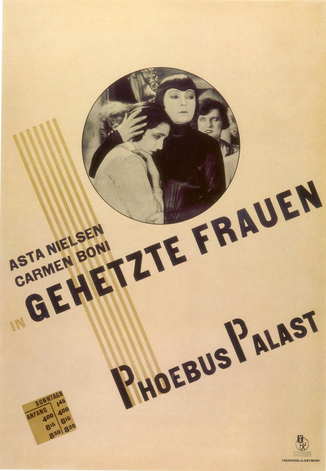
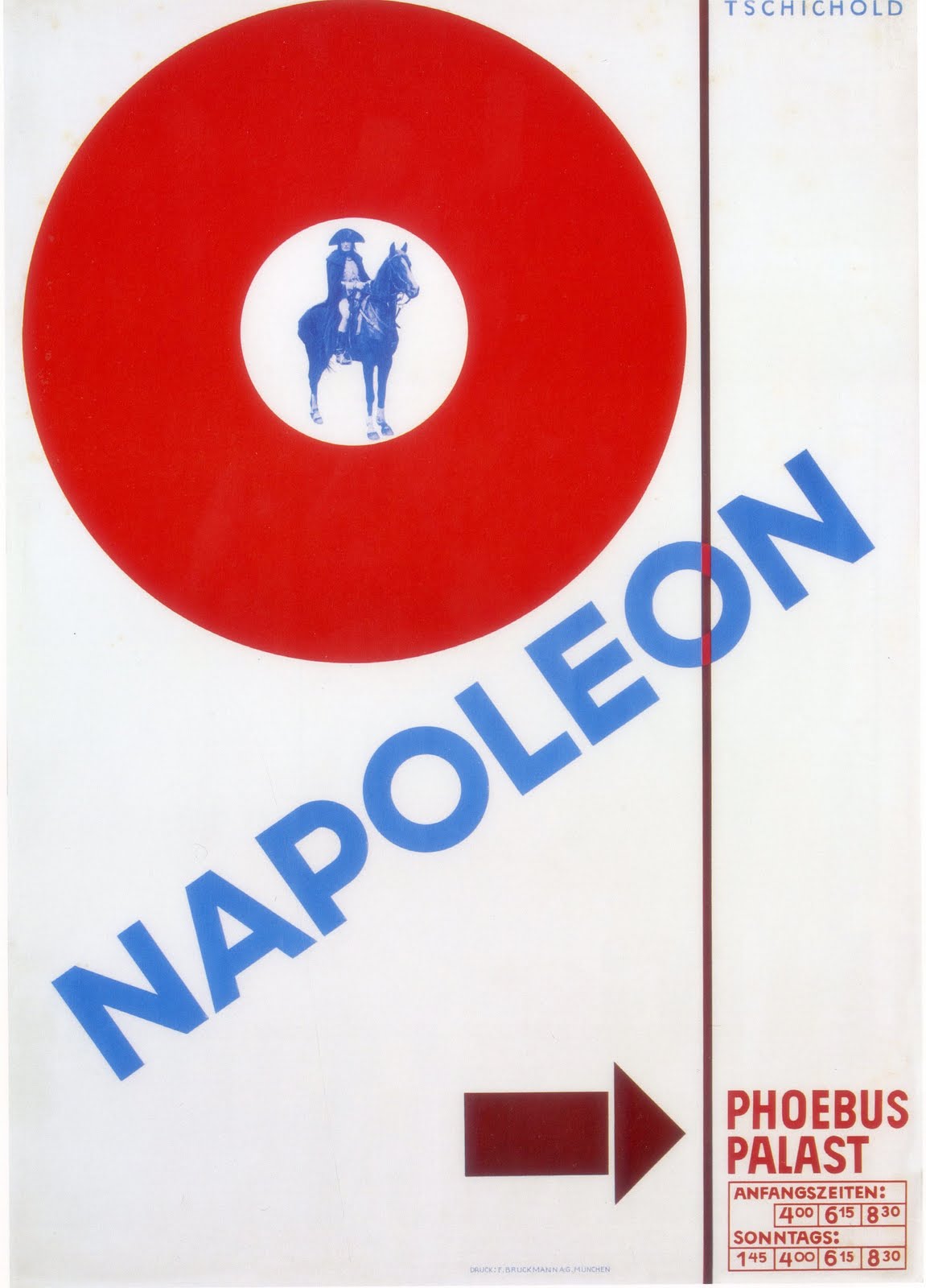
And so he emigrated to Switzerland, and then to Britain, where he began working for Penguin Publishers in the 1940s. Tschichold by then had repudiated many of his modernist principles, having returned to a more classical style. Nevertheless, here is his modern masterpiece, The New Typography, along with some of the movie posters he designed for Phoebus Palast during the 1920s.


The New Typography (1928)


That timeline you have is a little bit messed up. Here’s a more detailed version:
Dude grew up in Leipzig, went to see a design show and ended up meeting Moholy-Nagy, and changed his name to Ivan for a while. Published Elementary Typography in 1925, Die Neue Typographie in 1928, and was imprisoned for six weeks. He emigrated soon after to Switzerland, barely making a living by working part-time for a publisher.
Only after he came to Britain did he meet Morison and his army of neoclassicists. It’s also worth noting that even in 1928 he was already doing classical stuff, and this classical tendency never went away. Going to Penguin only made his classical side win. There was actually no hard-and-fast “turns” or “betrayals”. That “der Berufsphotograph” poster was done in Britain.
Dude NEVER emigrated to US—he stayed in Britain for the job, and then once the war was over and the pound plummeted, he returned to Switzerland. He died of cancer in Locarno, Switzerland.
You also missed the famous Tschichold-Bill debate.
Thanks for catching that. Have modified my thumbnail biography to more accurately reflect the timeline you mentioned.
Great to see an appreciation of Tschichold – probably the greatest typographic designer of the twentieth century.
But please – this is one of the weaker articles both in its political inferences and in some very sloppy factual mistakes – “And so he emigrated to the United States, where he began working for Penguin Publishers in the 1940s.” No
He was pursuaded by Allen Lane on Oliver Simon’s recommendation to be recruited to Penguin in Harmondsworth, England, UK – not US! – and returned to Switzerland a few years later – all the biographies are clear about this. Strange mistake.
Yes his politics and design principles are not always easily divined although he was one of the more literate of pioneers of graphic design and left multiple programmatic and best-practise guidelines, The New Typography, The Form of The Book (essay collection) and the almost revolutionary in industrial quality – Penguin Composition Rules. One of the classic housestyles for quality in detail taypography.
Anyone who was politically aware in that period in Germany – would we hope – have developed a healthy scepticism towards the slavish adherence to the stalinist communist party official doctrine – their role in the disaster of german politics – where Trotsky’s light shone strongest “The Struggle Against Fascism in Germany”.
That Tschichold never repudiated his politics is more than many of his generation achieved into the cold-war. His body of work speaks to his personal commitment to a new humanism and this was born out by his masterly switch, from being the programmatic standard bearer for subtle detailed functional modernist reform in typography, to his realisation that even that could become the basis for a stylisticly co-opted anti-social dogma adopted by both fascism and capitalism, and his post war advocacy and demonstration of a revival of humanist traditionalism in ‘vernacular’ everday publishing – in the service of quality publishing for working class auto-didacts. Tschichold was not alone in this eg the Neuraths (for whom he had worked) – see Anna Nyburg’s ‘Emigres’ – in advocating an enlightenment educational approach to critical literary consciousness for ordinary people.
I think criticising him for not being a card carrying stalinist in this period – does not do him the justice he deserves.
More sad that he had to end up doing pharmaceutical packaging for Vallium in later life – but even his packaging was still meticulously done.
Declaration of Interest – As Senior Designer Adult Text at Penguin in the late ‘eighties, early ‘nineties – part of my job description was ensuring adherence and maintenance of his Penguin Composition Rules – which even then still formed part of the contract for every piece of text typesetting commissioned by Penguin – and still does I expect.
Wow. I thought his house rules were scrapped along the way somewhere, but it’s heartening to know that Penguin still requires people to adhere to it!
Way beyond Penguin – because Penguin changed the volume of book consumption they were using many of the biggest and best organised compositers and printers – once those compositors had accepted and learned to work to Tschicholds rule’s – they became defacto the established standard for almost all British book typesetting because those compositors also set the work from other publishers – few other publishers would insist on substantive differences in their house-styles for mass market publishing – and so the post-war quality of British book design was substantially raised across the board in most respects by Allen Lane’s support for Tschicholds dictat.
The Rules were contractually enforced – resetting to adhere to the rules was the compositors/printers responsibility (red ink corrections rather than green or black for editors or authors changes at cost to publisher). If there was any doubt a synopsis of the rules was printed on the reverse of the standard Instruction Sheet for Text Composition that went out with every job.
This remains one of the classic case studies in Design Management.
Pingback: Jan Tschichold and the new typography — The Charnel-House | 100% S I L K