


Originally published in the
Cambridge Literary Review
.
Most children’s books do not come with instructions for how to read them. El Lissitzky’s About Two Squares is not most children’s books.
Lissitzky first announced his plan to write a “suprematist tale”[1] about two intergalactic squares while teaching graphic arts and printmaking at the Vitebsk Institute of Popular Art in 1920. Traces of the idea can be detected as early as September 1919, however, shortly after he arrived in the city. Initially a disciple of the Jewish folk painter Marc Chagall, Lissitzky soon came under the spell of the charismatic avant-garde pioneer Kazimir Malevich (who usurped Chagall’s role as rector of the Institute that winter). Almost immediately one notices a shift in the form and subject-matter of Lissitzky’s oeuvre, as he abandoned village scenes and stylized conventional figures in favor of planar abstractions and floating rectilinear shapes. Within a matter of months, his entire artistic worldview was transformed.


Part of this transformation involved a change in Lissitzky’s approach to typography and book design. These were fields in which he showed prior interest. He had prepared a songbook for the traditional Passover poem Chad Gadya in 1917, and then again in 1919. Both of these versions clearly demonstrate the abiding influence of Chagall, though by the time the second one was published, suprematist elements already began to enter in. Following the release of the 1919 edition, Lissitzky informed Malevich of his newfound perspective:
It is my belief that the thoughts we drink from the book with our eyes must be poured over every visible shape. The letters and punctuation marks, which introduce order to thoughts, must also be taken into account. Besides that, the way the rows are set corresponds to certain condensations of thought; these should be condensed for the benefit of the eye as well.[2]
Evidently, suprematism for Lissitzky had consequences well beyond the realm of the painted object. It implied a broader reconsideration of the medium of print. Lissitzky was an ardent — if self-trained — bibliologist, and in 1926 he hypothesized what effect modern art might have on the future of the book. “There are today two dimensions to the word,” he maintained in an article for the Gutenberg-Jahrbuch. “As sound, it is a function of time; as exposition, of space. The book of the future must be both.”[3]
Yve-Alain Bois, a Swiss art critic and Lissitzky scholar, has noted that authors only began to take an interest in the visuals of their books toward the end of the nineteenth century.[4] Questions of format, font, and layout generally seemed besides the point. Little attention was paid to the arrangement of text upon the page. With the advent of photography and improved printing technology, however, new possibilities were opened. Citing the development of “facsimile-electrotype (or half-tone blocks),” Lissitzky speculated that this would allow for greater flexibility in the illustration of written materials.[5] Great innovators like F.T. Marinetti likewise had a role to play in Lissitzky’s scheme, discerning the potential of boldface lettering and ALL CAPS to convey emphasis or emotion.[6] Nevertheless, the aesthetics of print continued to lag behind other fields of art until the outbreak of World War I, usually held up as a cultural watershed.
 01")
 02")
 03")
 04")
 05")
 06")
 07")
 08")
 09")
 10")
Russia was no exception to this trend. “Before October 1917,” Lissitzky explained in a catalog ten years later, “our artists hardly concerned themselves with typesetting. That matter was left to the printers.” He continued: “After October, many of our premier artists in different fields, hoping to express the new through the specific properties of each medium, took up the task of reinventing the book according to the material of the book itself — i.e., type.”[7] Painters especially participated in this process, starting even before the war, working together with poets to revolutionize the medium.[8] By the 1920s, swept along by the maelstrom of revolution, avant-garde bookmakers were employed in the production of posters as propaganda for the masses. Lissitzky even likened such placards and printed visual displays to single pages ripped from books, magnified and blown up several dozen times.[9]
This new movement, which sought to break down the barrier separating art from life, entailed the “death” of painting as it had hitherto been known. Aleksandr Rodchenko gave up painting in order to pursue photography and agitprop. Varvara Stepanova abandoned the canvas for fabrics and textile patterns. For Lissitzky, the prewar experiments in painting had simply prepared artists for the revolutionary enterprise of construction, an idea charged with meaning at the time. His celebrated PROUN series merely provided the point of departure, being “the way station between art and architecture.”[10] Similarly, the book displaced painting and sculpture as the most monumental art form of revolutionary Russia.[11] It was this fact, in Lissitzky’s view, that sealed the fate of older forms of artistic production. “Once the printed page started to seduce the artist,” he wrote morbidly, “painting slowly died.”[12]
Bois has referred to this rhetorical conceit regarding the death of easel painting as “the cliché of the era.”[13] Was it really nothing more than a cliché, though? Might it not have had a real sociohistoric basis?
Indeed, About Two Squares can be read as a dramatization of this very aspiration, though intended for children. Lissitzky stressed the importance of such literature in the upbringing of the New Man: “We should add to the number of illustrated weeklies the flood of children’s picture-books. Children’s reading teaches them a new plastic language. They grow up with a different relation to image and color, the world and space.”[14] About Two Squares recapitulates Lissitzky’s belief that revolutionary form heralds the arrival of revolutionary content, and that the former must act as a vehicle for the latter.


The book finally appeared in 1922, roughly two years after Lissitzky envisioned it, under the imprimatur of the Scythian press [Skythen Verlag] in Berlin. On the back cover, however, was a symbol indicating its origin in Vitebsk: the UNOVIS logo — a red square set inside a thin black frame, partially circumscribed within a circle. Scythian publishing house was loosely affiliated with the Left Socialist-Revolutionary party in Russia, run mostly by Russian symbolist poets living abroad. In some ways it may be seen as a prototype of later samizdat operations. About Two Squares was among the first modernist publications they put out.
We turn now to the text. The first page or so, in which the author addresses his readers with instructions for how the book is to be read, may be set aside for a moment. Lissitzky’s narrative unfolds straightforwardly enough:
here ARE
………………two
……………squares
flying toward the Earth
…………………………………from far away
and see
……………the black restlessly
craSH —
..….…..— scattering everywhere
and upon the black
…………………………the Red establishes itself clearly
So it ends
……..………further on…[15]
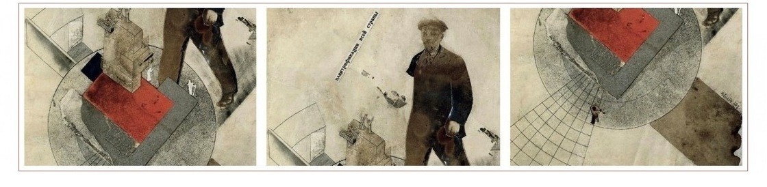
Glancing at the illustrations that accompany the text, one sees that the two squares mentioned in the opening line are red and black, respectively. The black square hovers just above the red, tilting slightly to the side. Both squares are about the same size. Everything else in the book is colorless, though the monochromy is broken up by the illusion of depth in some shapes contrasted with the flatness of others.
A few broad interpretive claims may be made at this point without risking too much controversy. First, the black square is suprematism. Or rather, it is Malevich’s Black Square (1913), which by then had effectively become a metonym for the movement. Second, the red square is communism. Dipped in the blood of the June insurgents of 1848, the red flag soon replaced the national tricoleur as the international symbol of revolution.[16] “In About Two Squares,” observes Bois, in his semiotic analysis of the work, “the political signified is extremely weak; text and illustrations are barely informed by it…Only the colors, whose symbolism is highly conventional, offer a clue.”[17] Here he is no doubt correct, but he remains hobbled by the steadfast immanence of his reading. Bois is unwilling to seek context outside the text immediately before him.


Clues may be sought elsewhere in Lissitzky’s corpus. In a manifesto written in Vitebsk on “Suprematism in World Reconstruction,” Lissitzky placed these two revolutions — political and aesthetic — side by side: “Into this chaos [of world war, civil war, revolution] came suprematism extolling the square as the very source of all creative expression. And then came communism and extolled work as the true source of man’s heartbeat.”[18] On the surface, this would seem to confirm the interpretation outlined above; and indeed it does. Yet there is a subtle polemic embedded in About Two Square’s disarmingly simple presentation. Namely, it is a polemic that takes issue with one of Lissitzky’s own prior formulations. Whereas he argued in the 1920 manifesto just cited that suprematism would eventually supersede communism as a higher phase of human collectivity, in 1922 his argument is the exact opposite.[19] The black square inaugurates a revolution in form, but this in turn must give way to the revolutionary substance supplied by the red square.
Malevich’s Black Square was thus significant for Lissitzky both as a premonition of 1917 and as a resolutely negative stance vis-à-vis the world of objects. Suprematism cleared the air, so to speak, relieving artists of the burden of representation. It took the fragmented bits of space left over by the cubists, which had been further set in motion by the futurists, and smashed these into even smaller smithereens. Recall the line: “see the black restlessly craSH — scattering everywhere.” Non-objective art was the death ray artists aimed at an outworn reality, and it shone with the force of all-encompassing annihilation. Like Rodchenko’s promotional poster for a movie of the same name (Death Ray),[20] also released in 1922, organic shapes disintegrate before the gaze of black geometric abstraction. This is not a mere formal exercise, either. Discussing Marinetti, Lissitzky wrote: “I should like to stress that Marinetti does not call for playing with form as form, but asks rather that the action of a new content should be intensified by the form.”[21] Form prepares the way for content, and is not satisfied with the pursuit of form for form’s sake.
Once the work of destruction is complete, moreover, the work of construction begins. Affirmation of the new requires the negation of the old. In his final published meditation this subject, toward the end of The Reconstruction of Architecture in the Soviet Union (1929), Lissitzky described these two moments — negative and positive — as belonging to a single “dialectical process.” As he went on to elaborate, this process “simultaneously affirms both the yes (plus) and no (minus).”[22] Here the great artist returned to a theme he had written about some years earlier in introducing the dadaist Kurt Schwitters’ magazine Merz, regarding the oscillation of positive and negative in infinity’s exponential growth.[23] But Lissitzky also echoed, albeit unconsciously, the doctrine of the interchange between Yes and No laid down by the German mystic theologian Jakob Boehme and later clarified by the philosopher Georg Wilhelm Friedrich Hegel.[24]

Turning back to the dialectical process Lissitzky mentioned, it is noteworthy that he would list the principal task facing revolutionaries after October as the destruction of tradition: “Our time demands designs that have their origin in elementary forms (geometry).” With the start of construction, artists took their cue from heavy industry and large-scale machinery, developing their designs “in the direction of basic utilitarian considerations and the satisfaction of basic needs.”[25] Lissitzky never succumbed to the delirious technophilia or rank mechanolatry of his peers Vladimir Tatlin and Aleksei Gan. For him, constructivism had less to do with copying grain silos or emulating turbines than it did humanity’s ability to govern its own destiny. If communism was to be, as Marx put it, “the riddle of History solved” (in which the present dominates the past rather than the other way around),[26] then all mankind must participate in its creation.
About Two Squares encourages its readers to heed this call in the introductory note printed on the opening page. Lissitzky’s advice ran as follows: “Don’t read this book. Take paper. Fold rods. Color in blocks of wood. Build…” Unlike Malevich, whose art was ultimately self-referential — having no goal beyond itself, as the aesthetic theorist Boris Groys correctly maintains — the art Lissitzky produced was made with the express intent of serving life.[27] It was not enough that the black square had wiped out all reference to the past. One must be the red square as well, asserted Lissitzky, and actively build the future. The ellipsis in the book’s last line (“So it ends, further on…”) meant to spill off of its pages onto the pages of History.


Notes
[1] «Супрематический сказ».
[2] «…Я считаю, что мысли, которые мы пьем из книги глазами, мы должны влить через все формы, глазами воспринимаемые. Буквы, знаки препинания, вносящие порядок в мысли, должны быть учтены, но кроме этого бег строк сходится у каких-то сконденсированных мыслей, их и для глаза нужно сконденсировать». El Lissitzky quoted in Khardzhiev, Nikolai. “El Lissitzky: Konstruktor knigi.” 1960.
[3] Lissitzky, El. “The Future of the Book.” New Left Review. (Volume 1, № 41: January-February 1967). Pg. 41.
[4] “Until the advent of modernism, writers paid little attention to typography. After the whimsical pictograms of medieval manuscripts and the mannered calligrams of Greek, Hebrew, Gallic, and Arabic poetry, typography became the restricted province of a few specialists…Though typographers designed new faces, writers were interested only in the arrangement of type by the linear foot, punctuated by an occasional ornamental capital. Except for…a few…exceptional cases), writers were either bored…or threatened by what they saw as an impediment to the presumed transparency of the signifier.” Bois, Yves-Alain. “Reading Lessons.” Translated by Christian Hubert. October. (Volume 11: Winter 1979). Pg. 113.
[5] Lissitzky, “The Future of the Book.” Pg. 41.
[6] “Marinetti, the siren of Futurism, also dealt with typography in his masterly manifestos.” Ibid.
[7] I.e., creating «новую книгу…материалом самой книги, т.е. набором». Лисицкий, Эль. «Художник в производстве». Путеводитель всесоюзной полиграфической выставки. Москва, 1927.
[8] “The new movement which began in Russia in 1908 bound painter and poet together from the very first day; hardly a poetry book has appeared since then without the collaboration of a painter…[T]he poets Khlebnikov, Kruchenykh, Mayakovski, and Aseev worked with the painters Rosanova, Goncharova, Malevich, Popova, Burliuk, etc.” Lissitzky, “The Future of the Book.” Pg. 42.
[9] “We ripped up the traditional book into single pages, magnified these a hundred times, printed them in color and stuck them up as posters in the streets.” Ibid.
[10] Лисицкий, Эль. «Тезисов к ПРОУНУ (от живописи к архитектуре)».
[11] “The book is the most monumental art form today; no longer is it fondled by the delicate hands of a bibliophile, but seized by a hundred thousand hands.” Lissitzky, “The Future of the Book.” Pg. 43.
[12] Лисицкий, «Художник в производстве».
[13] Bois, “El Lissitzky: Reading Lessons.” Pg. 116.
[14] Lissitzky, “The Future of the Book.” Pgs. 43-44.
[15] «вот два квадрата || летят на землю издалека || и видят — черно, тревожно || удар — всё рассыпано || и по чёрному установилось красно (ясно) || тут кончено, дальше…»
[16] Marx, Karl. The Class Struggles in France, 1848-1850. Translated by Clemens Dutt. Collected Works, Volume 10: Marx and Engels, 1849-1851. (International Publishers. New York, NY: 1977). Pg. 70.
[17] Bois, “El Lissitzky: Reading Lessons.” Pg. 116.
[18] Lissitzky, El. “Suprematism in World Reconstruction.” Translated by Sophie Lissitzky-Küppers. The Tradition of Constructivism. (Da Capo Press. New York, NY: 1990). Pg. 154.
[19] “if communism, which set human labor on the throne, and suprematism, which raised aloft the square pennant of creativity, now march forward together then in the further stages of development it is communism which will have to remain behind because suprematism…embraces the totality of life’s phenomena…
……After the Old Testament there came the New — after the New the Communist — and after the Communist there follows finally the testament of Suprematism.” Ibid., pg. 158.
[20] Луч смерти.
[21] Lissitzky, “The Future of the Book.” Pg. 41.
[22] Lissitzky, El. The Reconstruction of Architecture in the Soviet Union. Translated by Eric Dluhosch. (MIT Press. Cambridge, MA: 1970). Pg. 69.
[23] “In the year 1924 will be found the square root (√) of infinity (∞) which swings between meaningful (+) and meaningless (–); its name: NASCI.” Lissitzky, El. “Introduction to Merz № 8/9, April 1924.” Translated by Sophie Lissitzky-Küppers. Life, Letters, Texts. (Thames & Hudson. New York, NY: 1968). Pg. 347.
[24] “Boehme…employs the antithesis, or the forms of Yes and No.” Hegel, Georg Wilhelm Friedrich. Lectures on the Philosophy of History, 1825-1826: Medieval and Modern Philosophy. Translated by R.F. Brown and J.M. Stewart. (University of California Press. Los Angeles, CA: 1990). Pg. 129.
[25] Lissitzky, The Reconstruction of Architecture in the Soviet Union. Pgs. 69-70.
[26] “Communism is the riddle of history solved, and it knows itself to be this solution.” Marx, Karl. Economic and Philosophical Manuscripts of 1844. Translated by Martin Milligan and Dirk J. Struik. Collected Works, Volume 3: 1843-1844. (International Publishers. New York, NY: 1975). Pgs. 296-297.
[27] “Malevich shows us what it means to be a revolutionary artist. It means joining the universal material flow that destroys all temporary political and aesthetic orders. Here, the goal is not change — understood as change from an existing, ‘bad’ order to a new, ‘good’ order. Rather, revolutionary art abandons all goals — and enters the non-teleological, potentially infinite process which the artist cannot and does not want to bring to an end.” Groys, Boris. “Becoming Revolutionary: On Kazimir Malevich.” e-flux. September 2013.
Reblogged this on Malstil.
Pingback: Hannes Meyer, The new world [Die neue Welt] (1926) | The Charnel-House
Reblogged this on el blog de [ r-arquitectura ] and commented:
Sobre el contenido estético y simbólico del cuento infantil suprematista “SOBRE 2 CUADRADOS” diseñado y publicado por El Lissitzky en 1922.
Pingback: Incursiune în istoria coperților de carte – Haibun.md
Pingback: Early Soviet children’s books, 1924-1932 | The Charnel-House
Pingback: About Two Squares by El Lissitzky | LINES - BETWEEN