Hans Arp and El Lissitzky, The “isms” of art (1924)

.
Monoskop recently posted a scan of El Lissitzky and Hans [Jean] Arp’s Kunstismen (1924), translated roughly as The “Isms” of Art. It is reproduced here in its entirety, page by page, or in
full-text pdf format.

The original text runs in three parallel columns separated by thick dividers, very much in a constructivist style. Each column is in a different language: first German, then French, then English. Originally, I was planning on pasting the text from these in the body of the post. But I decided against it because, upon further examination, the translations are simply awful. German might have been a natural second language for Lissitzky; French and English were clearly not his strong points.

So instead, I’m posting an article that came out shortly afterward by the Hungarian art critic Ernő [sometimes Germanized as Ernst] Kállai, translated by John Bátki. Kállai’s work is not well known in the Anglophone world, though I did rely on one of his articles fairly extensively in an article on architectural photography. Here he summarizes the rapid succession of “isms” in art from 1914-1924 and astutely observes that this period ferment was then drawing to a close.

The twilight of ideologies

Ernő [Ernst] Kállai
“Ideológiák alkonya”
365 (April 20, 1925)

.
Translated from the original Hungarian by John Bátki.
Between Two Worlds: Central European Avant-Gardes,
1910-1930. (The MIT Press. Cambridge, MA: 2002).

Kunst kommt von Können. [Art comes from ability.]

The saying is very old and a commonplace, and has even acquired some ill repute; still, it is high time we pay heed to it and, more important, put it to use.

The age of ferment, of “-isms,” is over. The possibilities of creative work have become endless, but at the same time all paths have become obstructed by the barbed wire barriers of ideologies and programs. It takes a man indeed to try and fight one’s way from beginning to end, across this horrible cacophony of concepts. Not that all of these theoretical skirmishes, manifestoes, and conclusions for the record were not indispensable for the evolution of ideas, or were incomprehensible. Even the wildest flights of pathos, the most doctrinaire stylistic catechisms had their own merit. It was all part of the ferment caused by Impressionism, and the infighting of the various expressive, destructive, and constructive schools.

But all of this turmoil is now finally over. Our awareness of the diverse possibilities has at last been clarified, so that today we are witnessing a time of professional consolidation and absorption in objective, expert work. This holds true for the entire front: the areas of political, tendentious art and Proletkult as well as those of Cubism, Expressionism, Constructivism, Neoclassicism, and Neorealism — and also in criticism. The most extreme, most exacting measure of individual vocation and achievement is that which is being employed by each and every school or camp toward its own. The process of selection has begun, and its sole essential guiding principle is this: what is the artist capable of accomplishing in his own field, through his own particular means and message.

Continue reading

El Lissitzky, About Two Squares (1922)

spring-2008_hgd_poster

This short book, intended for children of all ages, is perhaps the best-known work of El Lissitzky (1890-1941). Lissitzky was a Russian artist, architect, designer, typographer, and photographer who was active in the avant-garde movement that flourished in Soviet Russia and in Germany, until the dominance of Socialist Realism by 1930 put a stop to its revolutionary activity. He directly influenced the typographical and display advertising innovations of the Bauhaus and De Stijl. This book entirely integrates modern typographical effects, as Lissitzky intended, with his illustrations in the Suprematist style.

The original book About Two Squares was printed by letterpress, even the slanted text and illustrations. It was first produced (“constructed”) in 1920 at the Soviet art institute UNOVIS in Vitebsk, and around April 1922 printed by Sycthian Press, Berlin, by Haberland Printers, Leipzig, in paperback, with 50 hardbound copies autographed and numbered, as the copyright page states.

A Dutch edition, published as Suprematisch worden van twee kwadraten in 6 konstrukties, edited by Theo van Doesburg, was published in The Hague by De Stijl, 1922. In October/November of that year, it appeared as a regular edition of De Stijl, vol 5 no 10/11. Also, 50 hardbound copies of the Dutch edition were numbered and signed by the author.

  1. About 2 Squares
    El Lissitzky
  2. To all, to all children
  3. El Lissitzky
    A suprematist story — about two squares.
    In 6 constructions: Berlin, Skythen, 1922.
  4. Don’t read this book Take —
    paper…fold
    rods…color
    blocks of wood…build
  5. here ARE
    …………two
    ………squares
  6. flying toward the Earth
    ……………………………from far away
  7. and see
    the black restlessly
  8. craSH — scattering everywhere
  9. and upon the black
    ………………………the Red establishes itself clearly
  10. So it ends —
    ……………further on
  11. UNOVIS
    constructed 1920, vitebsk

CRI_227458 pro02 pro03pro04 pro05 pro07 pro09 pro11 pro13 pro15 pro17 pro18 Continue reading

Mossel’prom [Моссельпром], 1923-1925

Mosselprom

Mossel’prom [The Moscow Association of Enterprises Processing Agro-Industrial Products] was built by the architect David Kogan between 1923 and 1924.  A ten-storey commercial building, it was one of the tallest structures in Moscow built during this period.

It became notorious through Vladimir Mayakovsky’s advertising slogan: “Everything for everyone — at Mosselprom.” 1924 saw the release of the film The Cigarette Girl of Mossel’prom by Iurii Zhelyabuzhskii, which featured the building.

The façade was renovated in 1997.

alexander-rodchenko-mosselprom-building-webmosselprom 1923Мы думаем, что снимок сделан между 1925−1928 годами

silver Gelatin PrintДом Правления Моссельпрома уг.Калашного и Кисловского пер. Россия, Москва, ЦАО, Район Арбат Фото датировано- 20.10.1924a70b0ec9bc1f6e7ff86abb521d0000f3d (1) Мы думаем, что снимок сделан в 1931 году

mp 0_afb98_79d7bba4_XXXL'Mosselprom. Coffee, cocoa, sausages, pasta, chocolate, caramel, candy, tobacco, cigarettes, beer, waters, wines. Nowhere but in Mosselprom.'2527315eaaadcf4c6509c1bd1e8b8380030

Radical chic: Avant-garde fashion design in the Soviet 1920s

In part, a re­sponse to Alana Mas­sey

.
Alana Mas­sey re­cently guest-wrote a short art­icle for The New In­quiry’s beauty blog “The Be­held,” which is usu­ally run by Au­tumn White­field-Mad­rano. Its title is rather ex­cru­ci­at­ing: “The Party’s girls and party girls: Ne­go­ti­at­ing beauty in the So­viet Uni­on.” Parts of it are okay, however, the in­suf­fer­able puns not­with­stand­ing.

What fol­lows is a brief re­flec­tion on her piece and some thoughts of my own, con­cern­ing one of its ma­jor la­cunae.

defrag- Varvara Stepanova's sport uniform. defrag- Varvara Stepanova's sport uniform Varvara Stepanova. Students in sports clothing designed by Stepanova. in performance of An Evening of the Book,. 1924. spelling out “intermission” 1 Varvara Stepanova. Students in sports clothing designed by Stepanova. in performance of An Evening of the Book,. 1924. spelling out “intermission”

Let’s get a few oth­er minor quibbles out of the way be­fore pro­ceed­ing to the stronger points Mas­sey makes, though:

  1. First, there’s this tone of cas­u­al fa­mili­ar­ity to the whole piece that really grates on me, and I could’ve done without the self-in­dul­gent an­ec­dote about get­ting a bikini wax at Spa Jolie. Could be that I’m just old-fash­ioned, even slightly prudish. Don’t think so, though.
  2. Bey­ond that, the Tiqqun­esque ty­po­lo­gies — the So­viet wo­man, the post-So­viet wo­man — also bothered me a bit, es­pe­cially con­sid­er­ing how Sla­vo­phil­ic the whole story is. Mas­sey seems not to real­ize that there are post-So­viet wo­men who aren’t from Rus­sia or Ukraine. Wo­men from Kaza­kh­stan or Uzbek­istan of­ten don’t have the “razor cheekbones and the per­man­ent pout of down­ward-slant­ing lips” she de­scribes (i.e., what Anna Khachiy­an has termed “Rus­si­an cunt face,” a vari­ant of “bitchy rest­ing face”).

Nev­er­the­less, all the stuff about im­pro­visa­tion and beauty stand­ards, the weird tricks and tech­niques by which So­viet wo­men would com­pensate for scarce con­sumer goods, seems to me fairly ac­cur­ate. There were ana­log­ous meth­ods when it came to mak­ing do with short­ages of food or amen­it­ies. Some of this bri­co­leuse men­tal­ity is prob­ably even pre-So­viet, as far as I can tell. For ex­ample, Louise Bry­ant wrote about an in­ter­ac­tion she had with the Bolshev­ik re­volu­tion­ary lead­er Aleksandra Kollon­tai back in 1921 as fol­lows:

Once I com­pli­men­ted her [Kollon­tai] on a smart little fur toque she was wear­ing. She laughed and said, “Yes, one must learn tricks in Rus­sia, so I have made my hat out of the tail of my coat which is already five years old.”

Most of the nar­rat­ive fo­cuses on the later dec­ades of the So­viet Uni­on, un­der­stand­able giv­en the av­er­age age of the sub­jects she in­ter­viewed. Yulia Grad­skova, pro­fess­or of gender his­tory at the Uni­versity of Stock­holm, and Anne Mar­ie Sk­varek, a mas­ter’s stu­dent at the Uni­versity of Ari­zona, provide some his­tor­ic­al depth, but on the whole the story moves from the 1960s up to the USSR’s dis­sol­u­tion in 1991.

Vera Mukhina

Style: Style: Style: Style: Style: Style: Style: Style: Vera Mukhina, sporty costume Style: Style:

Varvara Stepanova and Liubov Popova

Ref­er­ence was made in passing to of­fi­cial “mes­sages” about waist-to-hip ra­tios passed down from the 1930s, but it seemed just leap out of the blue. Not en­tirely sure what she’s talk­ing about.

It would be in­ter­est­ing to know what she made of the really av­ant-garde fash­ion ex­per­i­ments of the 1920s, however, with Var­vara Stepan­ova’s col­or­ful tex­tile pat­terns, Li­ubov Pop­ova’s sportswear, Vladi­mir Tat­lin’s work out­fits, and Vera Mukh­ina’s gen­er­al ward­robe ad­vice. Continue reading

Art, a modern phenomenon: An interview with Larry Shiner

Chris Mansour
Platypus Review 67
June 1, 2014
.
.

On March 18, 2014, Chris Mansour, a member of the Platypus Affiliated Society in New York, interviewed Larry Shiner, Emeritus Professor of Philosophy, History, and Visual Arts at The University of Illinois, Springfield and author of The Invention of Art: A Cultural History (2001), in which he argues that the category of art is a modern invention. What follows is an edited transcript of their conversation.

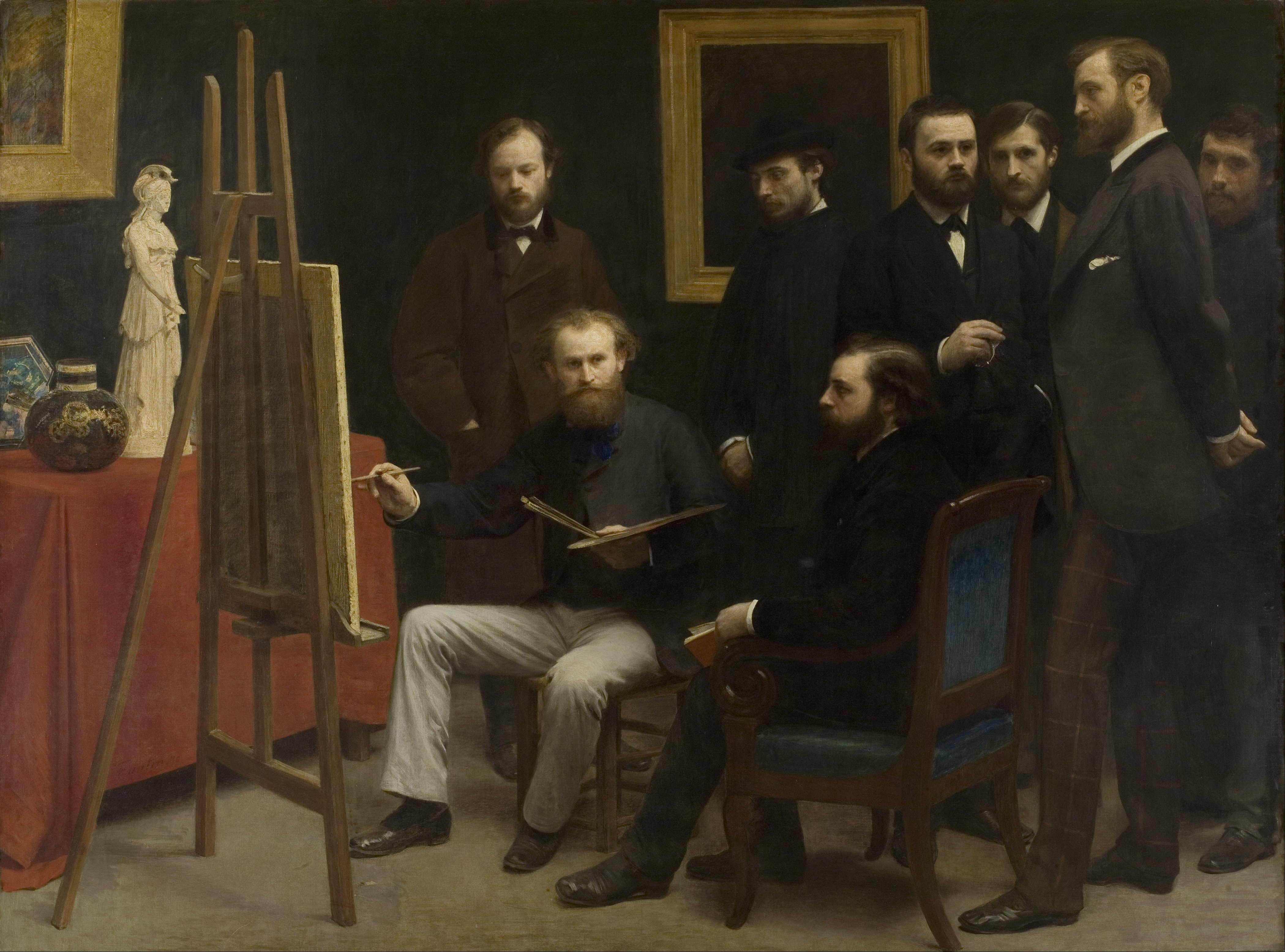
To be clear, I’m not in Platypus anymore. Nevertheless, this is a good interview. It covers a number of topics relevant to this blog. Also, for anyone who’s interested, the above painting is Henri Fantin-Latour’s Studio at Les Batignolles.

.
Chris Mansour:
 You first wrote The Invention of Art in 2001, nearly 15 years ago. Why did you feel the need to write a book about the historical development of the category of “art” at this time?

Larry Shiner: In the field of philosophical aesthetics, or the philosophy of art, the focus of attention in the mid-1970s to the mid-1990s was on the issue of how to define art. A famous essay by Morris Weitz argued that art cannot be defined, and that the most we can do to understand art is to resort to what Wittgenstein called “family resemblances.” This position was challenged in another influential essay by Maurice Mandelbaum, who said that we might not be able to define art in terms of any visual or perceptual properties, but we might be able to define it in terms of its relational properties, in terms of art’s social context. This set up a new pursuit for the definition of art, and it was considered a very important question during this time.

Among these attempts to generate a definition of the essence of art, one of the most influential writers was Arthur Danto, who said that the historical development of the concept of art needs to be taken into consideration if we are to define it at all. He believed that art’s essence has been revealed progressively, culminating in the twentieth century. I was skeptical of finding the essence of (fine) art as such. From my perspective, art does not have an ahistorical essence but is a multivalent term referring to a set of ideas and practices that function differently in society throughout time. Thus, The Invention of Art was an attempt to construct a sort of genealogy of art and to flesh out what it means when we consider art as an historically developing concept.

The historical transformations during the long eighteenth century, from roughly 1680 to 1830, culminated in the emergence of the cultural complex that we now call “art” today, that is, a semi-autonomous sphere of practices within society. This was a shared but unevenly developed trajectory of several art forms. Yet, despite the differences in the pace of the transformations of the various disciplines and mediums, these transformations were part of a total social process. Philosophy students as well as art history students need to know this history of the concept of art and recognize that (fine) art, as we now understand it, is the product of modern society and is barely 200 years old. Many art history books never bother to define what they mean by art, although there is a definition implied in what they exclude and what they cover. I consider my book to be somewhat of a companion volume for students and artists, helping them to situate art historically and to understand this historical process philosophically.

CM: You say art is barely 200 years old and is specifically a modern phenomenon. The early 1800s was a rapidly maturing period for global bourgeois society and culminated in the Industrial Revolution. What makes the practice of art in bourgeois society different from prior, art-like practices? Also, why is this historical distinction so significant in understanding art qua art?

LS: There is great importance, for me, in the dialectic of continuity and discontinuity in history. Confusion arises from the fact that, since the late nineteenth century, the historically specific phrase “fine art” — as distinct from art practices before this time — has dropped the “fine” out of the phrase and we now simply term it “art.” However, the meaning of the term “art” is incredibly ambiguous.

One meaning descends from what I call the “older, broader” meaning of art, from ars in Latin and techne (τέχνη) in Greek. This use suggests any human craft or performance that is done with some skill or grace; in one sense, everything humans do is an art. Here, there is a complete continuity from the caves of Lascaux to the present. It is not only the bison depicted on the cave walls that are art, but also the stone tools used to create them. Art as techne or ars lacks the precision of what we define as art today, which is roughly a semi-autonomous set of social practices, often geared toward aesthetic contemplation.

5341_lascaux_animals_cave_painting

The big change in art’s definition came when all those human arts got split up into various kinds: the first split was the opposition between the liberal arts and what the ancients called the “servile arts” (which was later replaced by the “mechanical arts”). That polarity was very different from the modern one contrasting the “fine arts” to the “applied arts,” “commercial arts,” or “craft arts.” The old schema of the liberal arts included what we call sciences and mathematics as well as the humanities. Part of what distinguishes the “fine arts” as a category of classification is that things like painting, poetry, architecture, music, and theater were pulled out of the old liberal arts and made into a separate category. In fact, things like painting and sculpture, because they involved physical labor, were not even considered part of the liberal arts until Renaissance painters, sculptors, and critics argued that these disciplines should be included among them. Up until the eighteenth century, for example, the producers of paintings and sculptures and the composers of symphonies were what I call “artisan-artists,” since these two terms, “artisan” and “artist,” were used interchangeably in English and many other languages. The old notion of the artisan combined genius and rule, inspiration and skill, creation and imitation, freedom and service. What began to happen in the eighteenth century is that these two notions were pulled apart and, by the end of the century, each term was defined as the opposite of the other term. It took decades for the new ideas of “Fine Art” and for the new ideals of the “Artist,” in contrast to the mere “artisan,” to become generally accepted.

By the time they did become generally accepted, the famous seventeenth-century “rise of science” had already split apart the liberal arts. At this time, the humanities, sciences, and fine arts began to emerge as distinct fields. A key point of my book is to show how the emergence of the category of fine arts, and its accompanying ideals of the artist and the aesthetic, occurred in conjunction with a new set of practices, institutions, and behaviors.

Paul Oskar Kristeller’s essays on the development of the classification systems of art were very influential for my book; I share his vision that the category of (fine) arts fully emerged only in the eighteenth century. Kristeller ended his essays with Kant and Schiller’s writings on the nature of the aesthetic. It seemed to me that the way we use the term art in the singular, as a kind of semi-autonomous subdivision of culture in the modern world, is still deeply influenced by the Romantics and the German Idealist philosophers. When I reread the literature, it struck me that the real culmination of the long process of constructing the social system of the fine arts occurred around 1830. This is why I speak of the long eighteenth century: You can see the beginnings of the fine art category and its institutions as early as the 1680s. My long eighteenth century encompasses the epoch spanning from the 1680s to the 1830s. By the 1830s, the fine arts system as we know it today was almost fully developed.

CM: How did the broader socio-political, institutional, and practical changes that happened in bourgeois society in the eighteenth century transform the liberal arts and fine arts system? What is the specialized fine arts system’s relationship to large societal transformations, and how was this relationship expressed?

LS: In very broad strokes, the historical transformation entailed the shift from an aristocratically organized society toward a society dominated by the bourgeoisie. The development of the market economy played an important role in the emergence of the categories of fine art and the artist. On the production side, the old order was dominated by the patronage-commission system. As an artist, you were typically either employed full-time by a lord or bishop, as were many of the great figures of the Renaissance and the seventeenth century, or you received commissions as an owner or member of an independent workshop with apprentices. Continue reading

László Moholy-Nagy, painting and photography

The following two texts focus on the Hungarian avant-garde painter and photographer László Moholy-Nagy. “Moholy-Nagy,” written by his countryman Ernő Kállai, principally concerns Moholy-Nagy’s early work in painting. As such, it describes their geometricism and abstraction, as well as their amenability to architecture. He’d been converted to constructivism, of course, by El Lissitzky during his travels to the West. Lissitzky managed to convince a number of members of the De Stijl group in Holland to adopt these principles as well, and stopped by later at the Bauhaus to reconnect with some of his former students and collaborators.

“Production-Reproduction,” the second article reproduced here, was written by Moholy-Nagy himself. It proved to be of immense importance for subsequent theories of photography as a form of art, and by extension art in general. Walter Benjamin read it and was influenced by it, as was his colleague (and sometimes plagiarist) Siegfried Kracauer. Also, if anyone’s interested, you can download the 1968 translation of Moholy-Nagy’s book Painting, Photography, Film (1925), part of the Bauhausbücher series.

23cda0e21cc3cec4f5d6c6f2c62f90df

Moholy-Nagy

Péter Mátyás [Ernő
Kállai] Ma vol. 9
September 15, 1921

.
In the extremes of its adventures, [László] Moholy-Nagy’s art reaches out on the borders of Cubism and Dadaism, and by organically uniting these opposite poles, he heralds the world of contemporary man who has managed to subjugate the machines.

Speaking purely in terms of form, he constructs either concentric or eccentric systems of forms or tries to interlink these opposing entities.

In the case of those works, in the monumentality of the few masses which are distanced so as to suggest inevitability, a strong will and elementary laws manifest themselves. In his use of the landscape motifs of the railway tracks, for example by the projection of the tremendous diagonal of a factory chimney leaning left, the leaning, resting forces, forces pressing tensed into vertical, are gathered into a compact architecture of form. Details of bridges and architectural structures, having lost all their utilitarian references and practical functions, freely elevate themselves into a self-willed order, an existence meaningful in itself. In another picture, based on a white horizontal stripe, with an almost organic vitality, the form swings and leaps into a slender vertical. This is all discipline of form, self-awareness, and pride, a totally new and individual manifestation of the modern constructive style, which is devoid of the sometimes dangerously short-changing form and color-splitting and space-complicating of the more differentiated Western Cubism. Colors develop themselves into form through their strong contrasts, through their brutal clashing with each other; the articulations of the form are of the most simple kind possible, and that space, which was left empty for a tabula rasa, constitutes a single, wide abstract wall behind the form, on which the artist’s credo concerning the future-shaping power of man’s civilizing activity is written up with lapidary laconicism.

However, Moholy-Nagy is not only a monumental lord and master-builder of contemporary life and of form, but with a naive admiration of the eternal-primitive child-barbarian, and with his raving joy too, he is also an ecstatic admirer of this life. In other people’s hands Dadaism serves as a murderous weapon of moral and social criticism. The exultation over a million possibilities of forms and motion which only the metropolis and modern technology can create, the sudden discovery of a new world and the dancing laughing youth of a vision totally open to the universe: all these are there in Moholy-Nagy’s art.

Semaphores of joys, forms and colors are standing on all points of space.

Freshly felt surprises and perspectives of gravitational pulls of manifold directions, of the many and of the many kinds, spring up from everywhere. Total geometrical abstractions as well as pieces, numbers, letters and realistically represented objects or fragments of objects picked from the primary reality proliferate in Moholy-Nagy’s eccentrical pictures.

This is a cosmic harmony, nonetheless it has not been kindled by a Futurist Romanticism and, still yet, these works, despite of all their divergences, form, after all, a perfectly intelligible system of absolutely interdependent units.

Anarchy is getting perceptibly arranged into a system of unified law. Although still not with the centralism of the self-containing architectonic structures, the pieces are coalescing into cohesive units, replacing the exploded conglomerate forms. Structures, still open, but set into motion from sharper defined and closer interrelated centers, emerge. Here, the mechanism of the modern machine and its kinetic system has been converted into art through the process of a fruitful coalescence of centrical and eccentrical pictorial factors with the creative principles connecting with Dadaism and Cubism.

Q 1 Suprematistic László Moholy-Nagy. (American, born Hungary. 1895-1946). Q 1 Suprematistic. 1923. Oil on canvas, 37 1:2 x 37 1:2%22 Space Modulator L3 László Moholy-Nagy. (American, born Hungary. 1895-1946). Space Modulator L3. 1936. Oil on perforated zinc and composition board, with glass-headed pins, 17 1:4 x 19 1:8%22

This fusion without inner contradictions of the style forming and negating trends of modern art gives Moholy-Nagy a chance to elevate his paintings on the terms of their own forms the level of vision. His art, after all, maintains a close link with its own well-defined objective territory. But in his relatedness to reality he is not satisfied with pointing out that meaning which is already present, although more or less hidden, in our senseless, chaotic age.

Just as the anarchistic manifestations of Moholy-Nagy’s art mean neither the rejection nor the approval of the all-destroying selfish instinct of the bourgeois free enterprise. Over problematical features of the present, Moholy-Nagy proclaims law and liberty which throw light on the perspectives of the infinite future.

Continue reading

Architectural compositions by Iakov Chernikhov, 1924-1931

Iakov Chernikhov, composition (1920s), 30 x 23,8cm Iakov Chernikhov, architectural fantasy 1929, 30 x 24 cm Iakov Chernikhov, experimental composition from Foundations of Contemporary architecture 1920-1928, watercolor and india ink on paper 29,9 x 23,8cm

Iakov Georgievich Chernikhov was one of the most outstandingly original artists of a period which produced many great talents. He was born on December 17, 1889 in the Ukrainian provincial town of Pavlograd, and studied first at Odessa College of Art, from which he graduated in 1914, and then at Petrograd’s famous Imperial Art Academy, now the Russian Academy of Art. Here he studied painting and education before switching to the architectural faculty in 1916. One year later, Chernikhov completed his teacher training and his degree thesis on methods of teaching drawing. He was called up for military service in 1916, but managed to continue studying, working, and teaching, though he was unable to resume his studies at the architectural faculty of VKhUTEMAS [the Higher Art and Technical Studios, previously the Academy of Art] until 1922. By the time he completed his degree in 1925, he had gained many years’ experience of educational theory and practice.

From 1927 to 1936 he worked for various architectural firms, designing and building a large number of projects. Until his death in May 1951, Chernikhov also continued to teach a wide variety of graphic arts subjects, including representational geometry and construction drawing. He became a professor in 1934, and was granted tenure the following year. By the standards of his time, he was simply a successful and fulfilled architect. His publications earned him a favorable reputation among his colleagues between 1927 and 1933, but after the Stalinist era his name disappeared from the scene. Only now, many decades after his death, are some of his books and examples of his wide-ranging graphic art being republished, and the magnitude of his unique creative genius becoming more widely recognized. Chernikhov’s first book, The Art of Graphic Representation, was published in 1927 by the Leningrad Academy of Arts. It was a textbook for the drawing course which he had devised but, despite its title, its purpose was not to teach readers how to draw. Even in Chernikhov’s time, the title had an old-fashioned ring to it, but he wrote the book with much more modern aims in mind. It is about graphic, spatial, and abstract compositions, and seeks to encourage students to use lines, planes, and solid to express beauty and movement without depicting anything known or recognizable, experimenting with all the boundless possibilities open to them. This thin volume is actually an extract from Chernikhov’s wide-ranging work. It was aimed at young secondary school and university students with no training in (or experience of) drawing or painting, and was ambitious in its aims. Publications like this were very unusual, since for the previous fifteen years, modern art had been used to express slogans, manifestoes, and statements of principle.

Chernikhov second from the right, Odessa 1910 Iakov Chernikhov standing in center in Odessa, 1910s Chernikhov at a construction site, 1928

Pedagogy

.
Few of the leading figures in modern art were teachers, but as a passionate educationalist, Chernikhov regarded his books primarily as textbooks, and his superb graphics simply as illustrations. He used his exceptional talents in the service of education and, unlike many other gifted and famous artists and architects, did not prescribe specific styles or techniques, instead focusing on such down-to-earth subjects as the use of materials or ways of depicting form and space. The importance of the imagination to Chernikhov is apparent in the title of the first chapter: “Fantasy and Object.” The Art of Graphic Representation is primarily a way of depicting imaginary spaces, something at which he excelled, and his drive toward systematization compelled him to share this knowledge with others. To his mind, the ability to sketch and draw were essential, but the most important thing was imagination. Chernikhov’s work, which even his harshest critics freely admitted was unique, provides impressive evidence of the dominance of the imaginary over the factual and representational. Continue reading

Aleksandr Rodchenko, Lenin workers’ club in Paris (1925)

Aleksandr Rodchenko, design for the 1925 exhibition222 Aleksandr Rodchenko, design for the 1925 workers club in the Soviet Pavilion, Paris122

My friend Agata Pyzik, author of the excellent Poor but Sexy: Culture Clashes in Europe East and West (Zer0: 2014), recently uploaded some pictures from her visit to Moscow. One of them shows her holding a copy of her book inside a reconstruction of the Lenin Workers’ Club by Aleksandr Rodchenko, originally designed for the 1925 Paris Exposition. The scale reconstruction traveled to Tate Modern back in 2009, and currently resides in the State Tretiakov Museum in Russia, which is where Agata had her picture taken.

She left a copy of Poor but Sexy in its display of revolutionary literature — a valuable addition, in my opinion. Right now I’m waiting to hear back from the LARB about my review of it, though if I don’t hear back from them soon I’ll likely submit it elsewhere. All I can say is pick up a copy and read it posthaste.

tumblr_inline_mhuto1o47j1qz4rgp1 rodochenko international_exhibition_of_modern_decorative_and_inudstrial_art1335908254148

For now, here are some photos and drawings of Rodchenko’s famous design along with some well-known passages written at the time of the exhibition. It appeared as part of the same show that saw the premier of architect Konstantin Mel’nikov’s outstanding Soviet Pavilion. Continue reading

Grigorii Barkhin, Izvestiia newspaper building in Moscow (1926-1928)

.
Some have noted the formal similarities between the original conception of Grigorii Barkhin’s Izvestiia newspaper building in Moscow and Walter Gropius’ proposed Chicago Tribune tower in Chicago. Barkhin himself attested to the latter’s influence on his own project. The initial plan for the building would have featured a base covering about a quarter of a city block, supporting a tall high-rise section that jutted suddenly skyward from it.

Owen Hatherley parsed their relationship several years back on his Kino Fist blog:

The Soviet skyscraper designs of the 1920s were strippings and rationalisations of the USA’s huge, atavistic fantasy-palaces. Aware of the mystificatory absurdity of a Woolworth Building, the extension of the Gothic up into the sky, the USSR’s early architects took their cue from the factories behind the facade. In one particularly memorable instance, this centred on the 1922 competition for the Chicago Tribune skyscraper. Bauhaus director Walter Gropius proposed a tower based on the printworks at the back, extending their modules into a futurist vision of cool, precise technology. It was ridiculed, of course, in favour of flying buttresses and Gothicky ornament. So in another act of plunder, the Soviet architects Grigori and Mikhail Barkhin proposed to build a slightly modified version of Gropius’ Chicago in Moscow for the Izvestia newspaper — and got it built, albeit drastically reduced.

We’ll return to this reduction later.

Walter Gropius and Adolf Meyer: Competition Entry for "Chicago Tribune" Tower (1922). Model, dynamic perspective.

Walter Gropius and Adolf Meyer: Competition submission for
Chicago Tribune tower (1922). Model, dynamic perspective.

Grigorii Barkhin, original plan for Izvestiia newspaper building (1926)

Grigorii Barkhin, original plan for Izvestiia building (1926)

A more proximate source of inspiration for Barkhin’s design (drafted 1926) was likely the Vesnin brothers’ Palace of Industry competition entry from 1923, which came a year after Gropius’ 1922 piece. One immediately notices the even greater similarities between them.

Here again there was some influence of Gropius’ project on the Vesnins’. (Both ultimately went unrealized). Indeed, there would later be some controversy when the rationalist architect Nikolai Dokuchaev accused his constructivist colleagues at VKhUTEMAS, the Vesnins, of copying the tower by Gropius. Dokuchaev further insinuated that there was some ideological contamination as a result, with some of the capitalist ideology of the Chicago Tribune proposal seeping into the structurally similar Palace of Labor. Moisei Ginzburg, by then chief theoretician of the OSA group, eventually intervened by pointing out the completely different functional contexts of the two buildings, while admitting their superficial resemblance.

The Vesnin brothers' unrealized proposal for the Palace of Labor (1923)

The Vesnin brothers’ unrealized proposal for the Palace of Labor (1923)

To be sure, the actual productive role of Barkhin’s Izvestia building was close to Gropius’ Chicago Tribune tower than was the Vesnins’ Palace of Labor, given that the first two were explicitly intended as publishing centers. Gropius’ tower would have likely served more as an office building for the writing staff than an actual printing plant, however. At least, that’s the role that Raymond Hood’s winning entry ended up playing. Barkhin’s building performed both tasks. Regardless, some overlap may be admitted.

Concerning the reduction mentioned earlier: due to material supply shortages, Barkhin and his younger brother, Mikhail, were forced to scrap the uppermost elevation. Instead, the base would be preserved as a continuous block, with rectilinear glazed façades as well as a series of distinctive circular windows over the right side of the entrance. The building still stands today, overlooking Pushkin Square in Moscow, though it now houses a Kentucky Fried Chicken store and King Sushi restaurant. Many of the photos included below are from the perspective of the park.

Enjoy! Click any of the images to enlarge, and scroll through the gallery.

Grigorii and Mikhail Barkhin. Dom Izvestiia, 1926-1927. Perspective view. Ink, watercolor, & white ink on paper.F-Moscou-Maison du Journal IsvestiaСтроительство типографского корпуса %22Известий%22Мы думаем, что снимок сделан в 1946 году  (направление съемки − север)Большой Путинковский переулок,5barhin2 Continue reading

May Day

Once there was an international, revolutionary workers’ movement. May Day was one of its central and most important holidays. Unfortunately, this movement is no more. Luxemburg rather sunnily surmised that “when better days dawn, when the working class of the world has won its deliverance, then too humanity will probably celebrate May Day in honor of the bitter struggles and the many sufferings of the past.” Today, however, these better days seem far more distant than they did when she first spoke of them in 1894.

Yesterday I linked to volumes 1-49 of Marx and Engels’ Collected Works. Below are two speeches, one by Rosa Luxemburg and the other by Vladimir Lenin, which at present must be regarded more as historical documents than anything that addresses a living reality.

Мая 1

Rosa Luxemburg

What are the origins
of May Day? (1894)

.
The happy idea of using a proletarian holiday celebration as a means to attain the eight-hour day was first born in Australia. The workers there decided in 1856 to organize a day of complete stoppage together with meetings and entertainment as a demonstration in favor of the eight-hour day. The day of this celebration was to be April 21. At first, the Australian workers intended this only for the year 1856. But this first celebration had such a strong effect on the proletarian masses of Australia, enlivening them and leading to new agitation, that it was decided to repeat the celebration every year.

In fact, what could give the workers greater courage and faith in their own strength than a mass work stoppage which they had decided themselves? What could give more courage to the eternal slaves of the factories and the workshops than the mustering of their own troops? Thus, the idea of a proletarian celebration was quickly accepted and, from Australia, began to spread to other countries until finally it had conquered the whole proletarian world.

The first to follow the example of the Australian workers were the Americans. In 1886 they decided that May 1 should be the day of universal work stoppage. On this day 200,000 of them left their work and demanded the eight-hour day. Later, police and legal harassment prevented the workers for many years from repeating this [size of] demonstration. However in 1888 they renewed their decision and decided that the next celebration would be May 1, 1890. Continue reading