
.
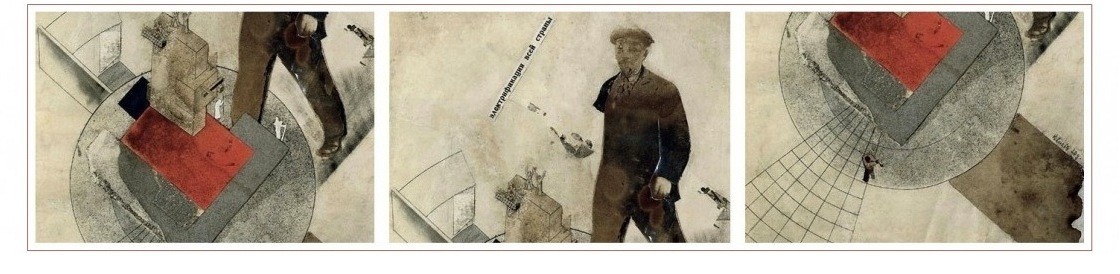
In 1929, the Soviet avant-garde journal Modern Architecture (Современная архитектура, or СА) published a special issue devoted to color and light in design. Below is an embedded link to the full issue on Scribd, as well as some lower-quality scans of individual pages. More later. Enjoy these for now.
[scribd id=191568476 key=key-2oaapy3l0912komnfx5m mode=scroll]


Colours, particularly bright ones, often make modernist building look tacky & cheap, instead of depressing and cheap. I guess it all comes down to the materials used.
You’re a miserable reactionary, Dekkers.
These have a great Ballardian feel to them. Nice find.
Pingback: The decantation chamber of Soviet modernism: VKhUTEMAS projects from the 1920s | The Charnel-House